A pencil, drawing itself

I’m sitting here in my apartment in San Francisco, where I’ve spent most of the last three weeks. As COVID-19 sweeps across the globe, I’m counting myself blessed that I have a job where I can work from home, that we have plenty of food and are safe and healthy.

The three Erasable Podcast hosts at the airport: Johnny Gamber, Tim Wasem and Andy Welfle
From left to right: Johnny Gamber, Tim Wasem, and me, Andy Welfle

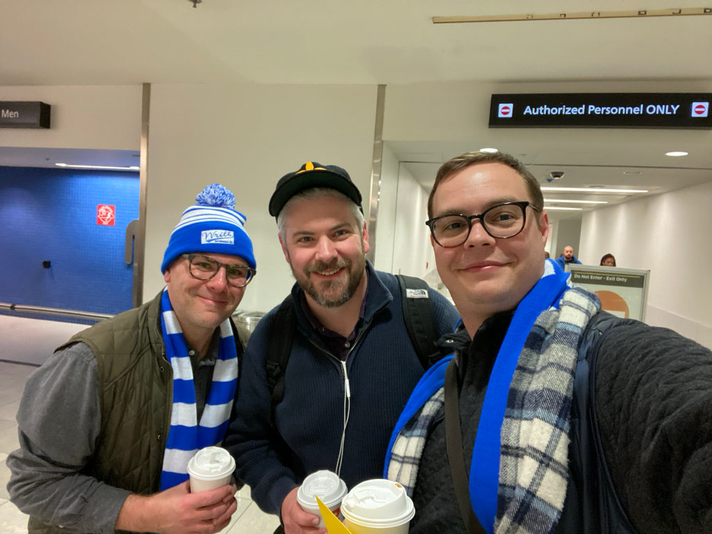
Just two weeks before it seems like we Americans was even aware of the severity of this pandemic, I had one of the best long weekends of my life, in Baltimore. It was the first time ever — in the six-year history of The Erasable Podcast — that Johnny Gamber, Tim Wasem, and I had ever been in the same place. We gathered there to record a live episode at the Baltimore Pen Show. It was a blast! We had our friends Brad Dowdy, Ana Reinert and Dade Scolardi on the show to help us make a case for pencils to a bunch of people who come together to buy, sell and trade expensive fountain pens.

Have a listen — it’s a fantastic episode.

But one of the highlights of the trip was to fulfill a promise we made to ourselves five or more years ago — if we ever met up in person, we were going to get matching pencil tattoos.

I agreed to that promise never thinking that we’d go through with it. A podcast about pencils doesn’t seem like it’d be long for this world. What is there to talk about for that long? How would we find time to come together from Baltimore, Johnson City Tennessee, and San Francisco to meet up?

Well, we did! So Johnny booked an appointment with his favorite tattoo artist, and now we had to figure out what to get.

After discussing a Caroline Weaver-style pencil down our arms, or a KUM wedge sharpener, and a few other things, I presented an idea to my co-hosts.

We shape our tools and they in turn shape us

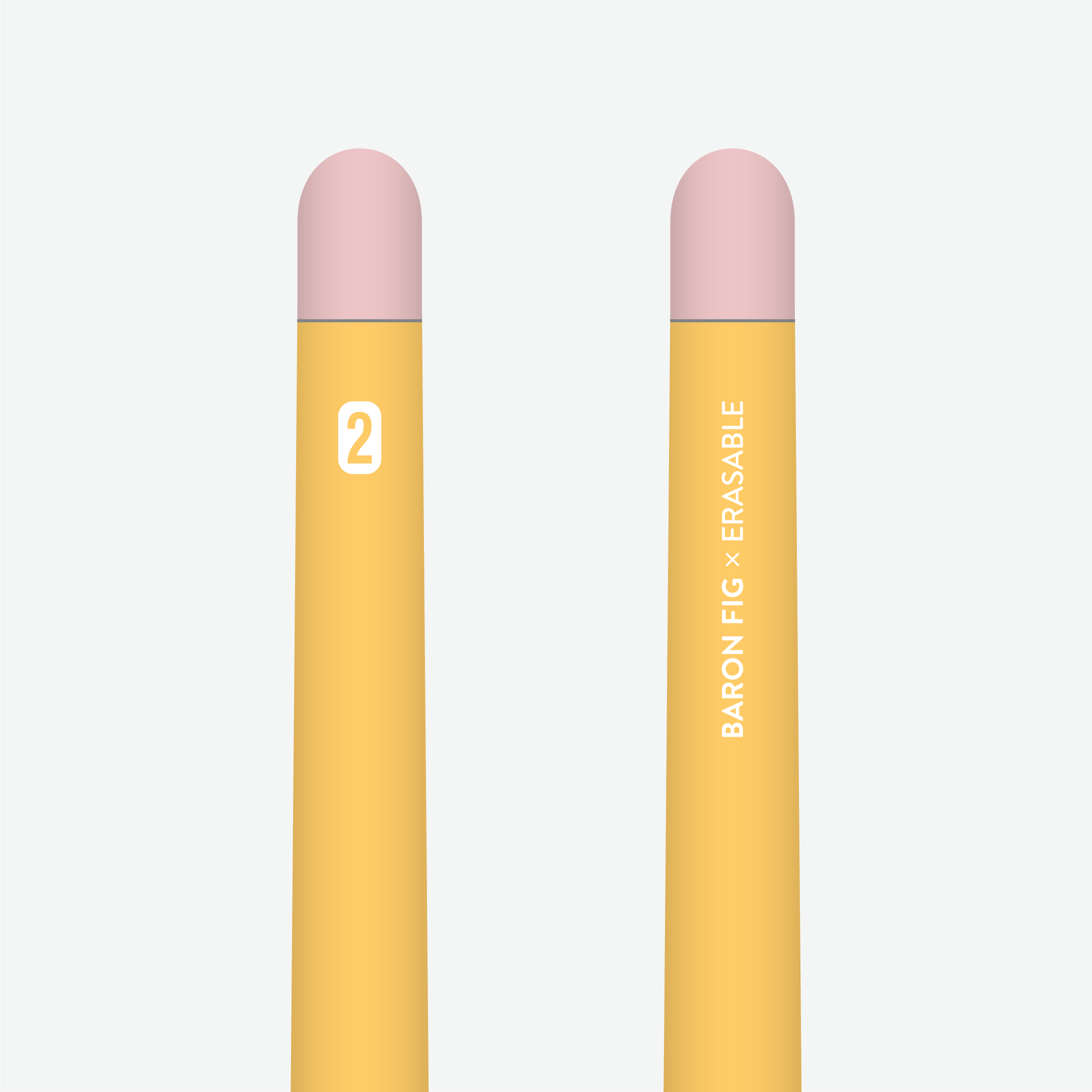
Back when I worked at Facebook (from 2014 to the end of 2016), I was really into the Analog Lab. It’s a fully functioning print shop, with a letterpress, screen printer, and multiple risograph machines. One of the designers at the Analog Lab, Tim Belonax, made a poster featuring an Escher-esque yellow pencil, bent in a triangle, drawing itself. It was accompanied by a quote that, at the time was attributed to Marshall McLuhan1: “We shape our tools and they in turn shape us”

A poster of a pencil, bent in a triangle, drawing itself, with a quote below that reads "We shape our tools and they in turn shape us." and is misattributed to Marshall McLuhan.
Johnny has that poster hanging in his bedroom — photo courtesy of Johnny Gamber of Pencil Revolution.

I’ve always loved that pencil. There’s something about the shape of it, bent around, drawing itself that appeal to me, because so much of my interest in using creative tools (like pencils, or typewriters, or software application) has taken a meta turn — I create media about pencils. I now work at Adobe, which makes creative tools.

If I were to describe my relationship with creative tools, it’d be not dissimilar to that quote, and the pencil drawing itself is the perfect emblem for that.

Luckily for me, Johnny and Tim connected with the image, and we agreed to get this design embedded into our skin for the rest of our natural lives.

Three arms, each with a different version of the same design.
Three variations on a theme. From left: Johnny’s teal and purple tattoo, my version in the original colors, and Tim’s outlined tat.

We all had a slightly different vision for how it would manifest, though. Tim preferred just the outline of the illustration. Johnny, who is the most tattooed of us (this was the first for Tim and me) got it on forearm next to a few other designs, and colored the pencil teal and purple to match. I decided to be as true to original vision as possible, with solid bright yellow ink and a bright pink eraser.

My arm with the almost-healed tattoo on it.
My arm, almost healed. (There’s still a little redness under the yellow.)

So, now it’s official — I love pencils and I have the ink (ironically) to show it! And Johnny, Tim and I have an unerasable reminder of how our mutual hobby binds us. Three weeks later after the scabbing and the redness has lessened (I’ll spare you the details, but I’ll just saw that , my sensitive skin was pretty angry at me), and I’m still pleased with my decision.

A huge thank you to Tim Belonax for the original design, Hunter Spanks, our tattoo artist, and of course Johnny and Tim for taking this journey with me!

And PS: because I’ve heard this question a LOT — it didn’t hurt as much as I thought it would, but it definitely hurt.

  1. This quote is often attributed to McLuhan, but after some digging, it’s thought that it was actually John M. Caulkin, a friend of McLuhans, who said, “Life imitates art. We shape our tools and thereafter they shape us.” ↩︎

A pen that’s dressed like a pencil

Things have been quiet around this blog for the last couple of years, but it’s not for lack of effort and interest in the pencilsphere.

One big thing that’s happening in my world is that my Erasable Podcast (130 episodes strong!) co-hosts and I are going to be going to the 2020 Baltimore/Washington International Pen Show to do a live episode on Friday, February 28!

Yes, we’re infiltrating the inky enemy and pronouncing our graphite propaganda. It’s been my (admittedly limited) experience that while the majority of pen show attendees don’t give a shake about pencils, there are a small but interested contingent who have just never thought about good-quality pencils. All they need is a little education and encouragement, and we’ll get them well on their way to regular graphite usage.

In order to raise the money to get to Baltimore (I’m flying in from San Francisco, and Tim from East Tennessee), we partnered with our friends at Baron Fig to customize their fantastic (and highly collectible) Squire pens and give it a makeover that’s relevant to our interests.

Introducing the Baron Fig X Erasable Number Two Squire!

The Baron Fig X Erasable Number 2 Squire Pen

This baby has ALL the features:

  • A bright #2-pencil-yellow anodized aluminum body
  • An eraser-pink anodized twist nock at the top.
  • A rollerball refill with a rich blue ink, in tribute to our favorite mass market pens, the blue Bic Cristal: the pencil of pens.

Baron Fig x Erasable Squire - Detail - 01

So here’s the rub: We have to place the order with Baron Fig all at once, so if you’re interested in getting one, you need to order it by this Friday, December 13, 2019 (five days from this posting). We might do it again, but we have no idea!

And for those of you looking for a nice Christmas gift for the pencil lovers in your life, I’m afraid this isn’t going to work for you — we’re not expecting this to be ready until late January.

But otherwise, we’d love your support, and in turn, you get a pen that when you know you must use a pen, you’re still supporting independent pencil media ventures.

Check out the Erasable Shop to buy a Number Two Squire for $60 »

No. 2 — a beautiful pencil-scented fragrance with an unfortunate name

I’m taking a break from my not-actually-a-blogging-hiatus here to share something interesting. You may remember my post from 2014 about the “Number Two (Pencils Shavings)” perfume from DSH Perfumes. It was designed to be a wearable essence and a scent for a room diffuser, though it never really struck me as really smelling like pencils.

Well, there’s a new pencil-scented fragrance in town, and it’s also called “No. 2,” this time from Portland-based artists Rory Sparks and Catherine Haley Epstein. They combined their love of pencils and perfume into a perfect fun project. Rory, a listener of The Erasable Podcast, was kind enough to send me a sample for review.

IMG_8894

The sampler spritzer of No. 2, kindly sent to me by the artist. The pencil stub is a nice touch!

I have to admit, the presentation is fantastic. My sample spritzer came wrapped with a short pencil stub to reinforce that the “No. 2” title was, in fact, referring to the pencil grade and not how people usually associate “number two” to smells.

Here’s the thing. While this scent smells distinctly different than what I remember the DSH scent to smell like (though I don’t have that vial any more to compare), it still doesn’t really smell like pencil shavings. I suspected the problem may be mine, and not the perfumes, though, so I took it into work and shared it with some coworkers.

Sure enough, I got a lot of comments about it smelling “woody” and a little “mineraly,” which I think confirmed that suspicion. My sense of smell is pretty out of tune. I blame years of bad childhood allergies and a perpetually stuffed nose and swollen sinuses.

Here’s the official description from the product page:

This scent was designed to honor the pencil. Like a pencil it is sharp, may be used as an under layer and blends in with just about everything. Yellow paint, splintered wood and metallic graphite serve as the springboards. The scent is made entirely of natural components of trees, leaves and citrus. Enjoy!

IMG_8895

Here’s the joint artist statement and a very cool personalized golf pencil from their ongoing art project.

If you want more information on this scent-based art project, check out Catherine Haley Epstein’s website, MindMarrow, for her project statement. And, if you want to smell like you just sharpened 50 pencils (as I did the other day), head over to her shop for various volumes and packaging options of the scent.


Plumbago, issue 3 is almost here!

This is something I’m very excited about, folks.

A year ago when we started Plumbago Magazine, as a paper companion to The Erasable Podcast, we just wanted to get some of our friends to submit drawings, or written words, or something that we could photocopy together into a few pieces of paper, folded and stapled.

Then, last summer, Issue 2 came out, and we suddenly had 36 pages full of writing, illustrations, comics and more about pencils. We made 300 copies, which seemed like a lot, but — wow! — that quickly sold out. (You can still buy a PDF copy of that issue, though.

Plumbago Magazine, Issue 3

For Issue 3, due out in January, I really wanted a whole issue dedicated to poetry and fiction. About pencils. I figured it would be slim pickings compared to Issue 2. But was I wrong!

Folks, we have almost 70 pages filled with a dozen short stories, many poems, illustrations, comics, paintings, graphite art, and more!

And yes. Everything’s about pencils. (Or, at least, pencils play a part in the story.)

And we’re making many more copies, so I hope we can keep them in stock for a while.

Here’s just a quick list of some of the content within:

We’re trying to sell a bunch of copies, yes, but only because — okay, mostly me — am really excited to see this come to fruition. It’s been a labor of love for the last two or three months, and I couldn’t be happier with it.

(And any revenue above and beyond printing, assembly and mailing costs will be donated to Heart to Heart International, a nonprofit providing medical relief to the victims of Hurricane Maria in Puerto Rico. Because we don’t make enough to pay contributors, I don’t want to make a profit myself.)

I’m afraid these won’t be available for Christmas, but my goal is to get orders out the first or second week of January. They’re being printed at a print shop, but the folding, stapling, trimming, and corner-rounding will be done right here in my one-bedroom apartment (Katie is thrilled, let me tell you).

So place your order today. This is your chance to see the creativity and passion that runs through the internet pencil community.

Harry Marks on the Dime Novel Field Notes edition

I don’t often have guest reviews on this blog, but when Harry C. Marks comes at me, I know it’s gonna be good. Harry’s an internet-friend who I’ve made sure to hang out with in real life several times, a long-hand novelist, and, like me, a stationery lover. He recently reviewed the latest Field Notes release, Dime Novel.


Field Notes Dime Novel. Photo by Harry C. Marks.

I’ve appreciated Field Notes notebooks for some time. I wouldn’t call myself a “fan” in the truest sense as I tend to skip most releases. Nor am I an obsessive collector, so when an edition comes out that captures my attention, it’s something special.

The first Field Notes I ever bought were the Drink Local editions. The perfect notebooks for Fall in hues of brown and orange, fallen leaves scattered on the table. Even the covers crunched when I cracked their spines.

Then came the Workshop Companion edition—six notebooks meant for six different kinds of projects, from woodworking to car repair. I’m not much of a handyman, but the package was too beautiful not to have on my shelf.

Finally, there was Byline. This was it: the perfect Field Notes for me. A departure from their usual staple-bound pocket fare, the Byline was an extra-long, spiral-bound reporter’s notebook clad in a utilitarian gray and filled with some of the smoothest, creamiest paper I’d ever used. Its brutalist aesthetic concealed an inner beauty, 70 pages of gold between two layers of rock—and I craved more. I traded with friends, some sent me spare books in care packages, and I hoarded them among my growing collection.

I thought I’d never find another book as perfect as the Byline. Then I opened my email last Monday afternoon.

Field Notes Dime Novel. Photo by Harry C. Marks.

The Field Notes Dime Novel Edition is the company’s Fall 2017 release and the 36th limited edition in the lineup.

And it. Is. Gorgeous.

Field Notes Dime Novel. Photo by Harry C. Marks.Reminiscent of old dime novels of the 19th century, the notebooks stand at 4-1/4″ by 6-1/2”, roughly the same dimensions as their namesake. Three separate notebooks comprise the 72 pages within and are Smyth-sewn inside a thick, brown-orange cover.

Field Notes is no stranger to experimenting with its covers. The blinding, aggressive Unexposed editions were better left that way. The cherry veneer of the Shelterwood put a tiny tree in everyone’s pockets. The Snowblind edition forced writers and note-takers out of the house as its stark white cover shifted to blue when exposed to sunlight. These gimmicks all had the same purpose: differentiation. No other pocket notebook had a wooden cover, nor one that changed colors in sunlight, and no company was blind-mailing subscribers random notebooks without first knowing the contents of each envelope.

This is what makes the Dime Novel edition so interesting. The form factor is different from the usual lineup, but not so drastic as a Byline. The cover doesn’t have a pop-out ruler or foil coating. It’s just brown paper debossed with black ink. While more elaborate than, say, the America the Beautiful edition, it lacks the pop of some of the more intense covers mentioned above.

Field Notes Dime Novel. Photo by Harry C. Marks.

That said, the Dime Novel cover isn’t simple. Within its black borders are lines of text meant to sell the notebook and illustrate its purpose. “Practical Beauty and Value,” “Adventures in Creativity,” “A Pocket Companion” all adorn the front, arranged to fill the space and yet be easily glossed over. The two things that stand out are the words “FIELD NOTES” at the top and “‘Dime Novel’ Edition” toward the bottom. Everything else is white noise. The surrounding text provides dimension, but can be easily ignored.

The original Beadle dime novel covers were not meant to be ogled. They were there to keep the pages from falling out. I see Field Notes’ homage in much the same light; the deceptively simple cover is there to protect your words and sketches, then get out of the way. What’s surprising about this edition is just how inspirational and aspirational it seems. This is a book begging to be written in and yet holding it, it feels too beautiful to sully with one’s own musings. How funny is that? A notebook modeled on cheap, mass market “literature” isn’t cheap looking enough for the average to-do list.

The 72 numbered pages inside are a hearty 70# stock seemingly made for pencil. I tested the paper with a Blackwing 602 (firm core) and a Blackwing 24 (extra-firm core), as those are the two pencils I use most. The paper has a very slight tooth to it that grips the point tightly, but doesn’t erode it to a nub after a few strokes. Artists and sketchers will probably like this paper a lot, but I defer to them for final verdicts, as I do fountain pen users. As a pencil user, I’m pleased.

Field Notes Dime Novel. Photo by Harry C. Marks.

This edition feels like a paperback in the hand. Given a few weeks in a back pocket, it’ll probably start to look more like an original dime novel than the crisp notebook in these pictures, with the cover crushed and faded like your granddad’s old hat. My only complaint concerns the blank pages. I’d hoped a notebook centered around literature would’ve provide writers with the lines necessary to write their own, but blank is more versatile. Fair enough. It’s probably my bias talking anyway—I almost never buy blank notebooks and I have no use for grids.

NaNoWriMo is fast approaching and I’ve been outlining my first attempt in a Byline. I’d originally planned to knock out my daily 2,000 words in Scrivener on my laptop, but the arrival of these Dime Novel notebooks have presented a new challenge. With a guide slipped behind each page, might I tackle the Kerouac-ian effort of writing 50,000 words in one month by hand instead? The thought of seeing what could become a published novel get its start in a such a format is enticing. Even more so when I imagine the mason jar on my desk stuffed with Blackwing 24 stubs by the end of November.

Whether I decide to tackle NaNoWriMo digitally or otherwise is yet to be decided. What’s certain is my lust for this latest Field Notes edition. These books will be used and for something greater than to-do lists. They deserve it. Sometimes, you don’t need to reinvent the wheel to capture the attention of a jaded group of collectors. Sometimes, you just need to make a simple, beautiful notebook—a work of art meant to inspire other works of art, and these notebooks have inspired me.


Many thanks to Harry C. Marks for his review of this beautiful notebook! You can find Harry online at HCMarks.com or listen to his podcast, Covered, about writers and their books. In his current season,  he’s talking exclusively to women authors about their books, and recently chatted with pencil friend Caroline Weaver about her book, “The Pencil Perfect.” It’s so good, and very pencilly, so you should have a listen. —Andy